
The website is often the first point of contact with users who are looking for a hotel and, as we have also highlighted in other articles, it is therefore crucial to offer an experience in tune with the identity of the property. In 2025, hotel website design continues to evolve, blending refined aesthetics, interactive experiences and visual storytelling with an impact, between trends that continue to resonate, and innovation that has the potential to become must-haves. Whether creating a website from scratch for a new opening or undertaking a complete revamp, here are 8 trends to draw inspiration.
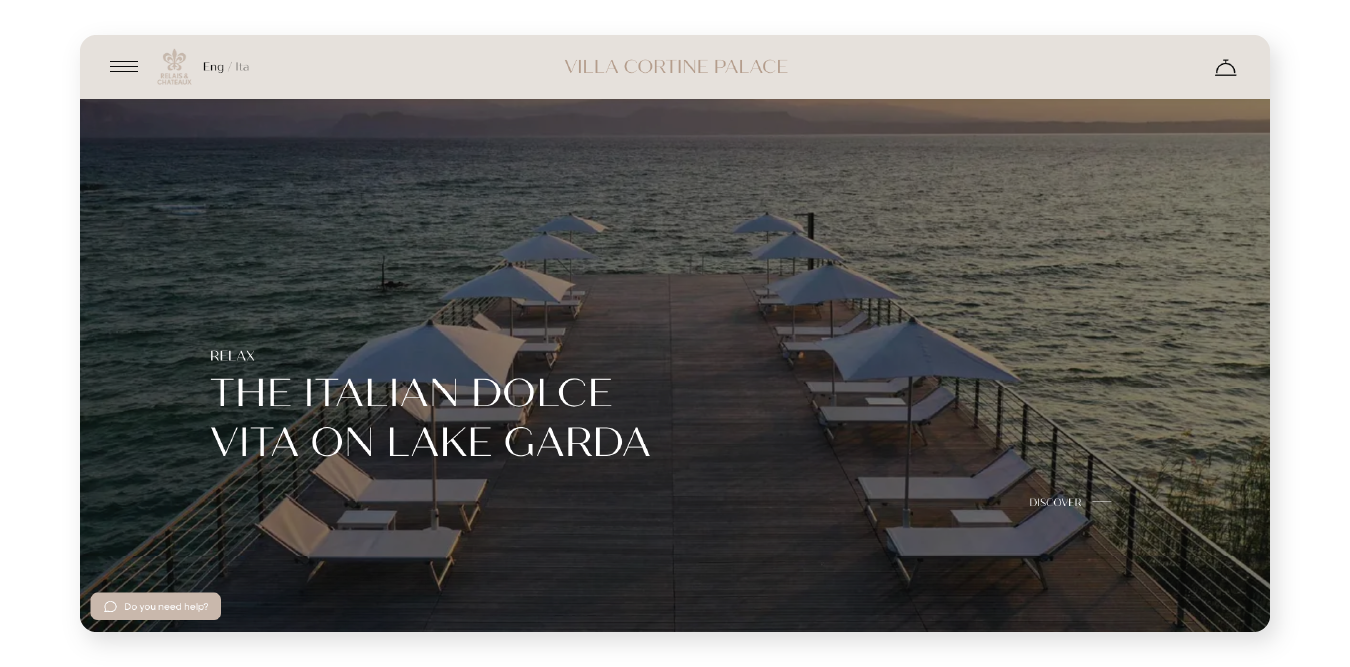
The paradigm of quiet luxury seems to have also found its place in website design. In fact, more and more establishments are opting for "less is more" graphics to communicate luxury, elegance and exclusivity, in which sophisticated minimalism dominates the picture, with clear layouts, well-defined spaces and evocative images that don't flaunt opulence but rather highlight the sense of serenity and wellbeing that the establishment offers its guests. Perfect examples of this trend are the new site of Villa Cortine Palace Hotel, a late 19th-century period residence characterised by a very high level of service, which for its official site chooses few graphic elements, leaving ample space for photos and short emotional copy, but also the site of Canary Riverside Plaza where the images with an essential flavour, soft colours and incisive phrases succeed in perfectly conveying the class of this five-star establishment in the heart of Canary Wharf in London.
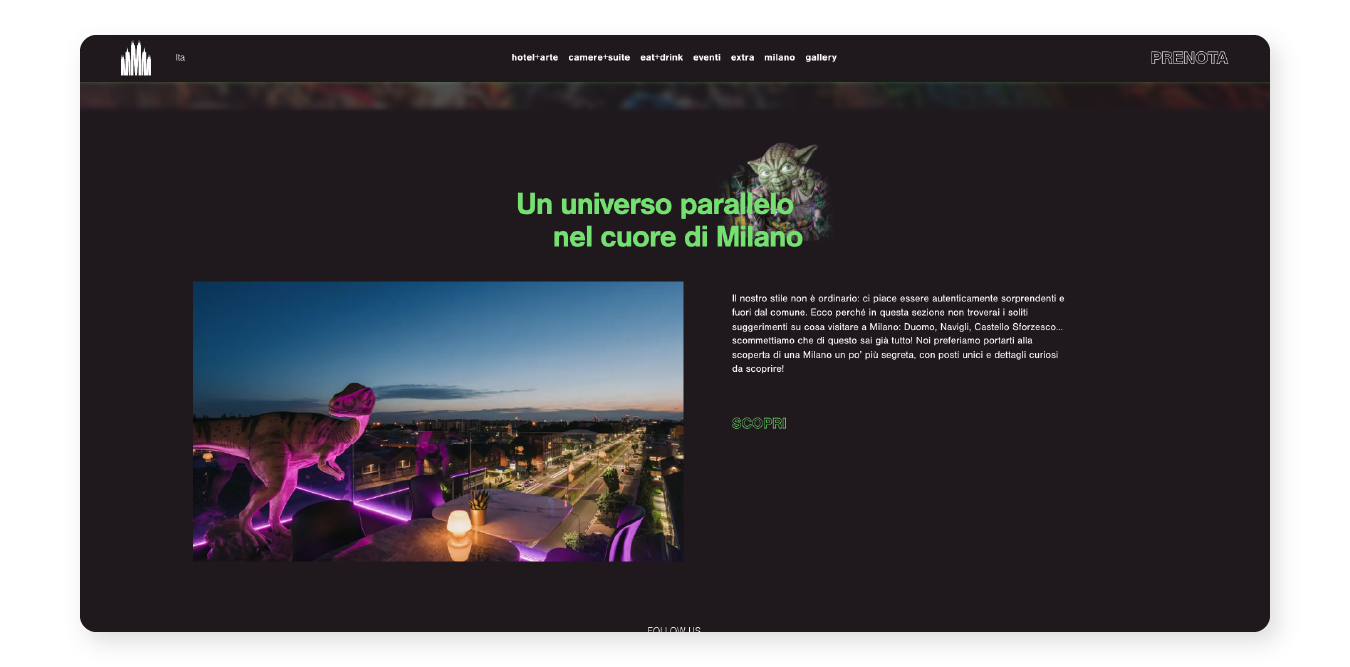
A property that focuses on a unique personality should also choose the same strategy for its website, with attention-grabbing images in the application, striking and evocative texts, bright colours and bold animation choices. To understand what we mean, just browse the Collini Rooms website: the colourful and unconventional spaces of this Milanese property, designed to transport guests into another reality, find their natural continuity online, with a mix of impactful graphics and direct phrases
Among the animations deployed to enhance the user experience, the use of the horizontal scroll, which is very effective for presenting photo galleries or thematic paths, deserves special mention. On the Minareto's official website, this approach succeeds in adding an unexpected touch to the browsing experience, making it an interactive and pleasant part of the site, and emphasising the rooms and services offered by the property.
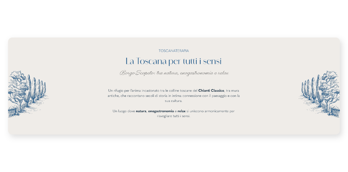
In addition to classic photographs, customised illustrations can be adopted to provide added character and originality. These images can be used as the header of one or more pages, to conjure up suggestive atmospheres that transport the user to an exclusive world, as is the case on the Torre Capranica and Palazzo Caruso sites. Alternatively, they can be used more subtly, as decorative elements that intersperse the photographic sections and emphasise the content of the paragraphs: an excellent example of this is the Borgo Scopeto site, with small woodcut-style drawings that are a reference to the Tuscan nature where the resort is located.
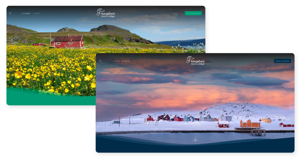
One of the latest trends in hospitality websites is the enhanced customisation of the interface depending on the time of year or day, with a switch button on the homepage. This trend proves particularly effective for hotels whose mood changes drastically with the passing of the seasons, as is the case with the Kongsfjord Artic Lodge on the Norwegian fjords or the Hotel Regina in the Swiss Alps, which display different activities and colour choices on the homepage depending on the chosen season. This solution can also be adopted to show off the beauty of the view, both during the day and at night: this is the case of Villa Athena Agrigento, which successfully makes the most of its unique position on the Valle dei Templi, displaying it in all its splendour, under the sun or illuminated by moonlight.
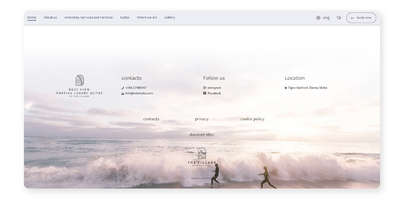
There are more and more hotel sites where the footer is not just an area for information, but becomes a real design element that embellishes the aesthetics of the site and takes users on an emotional journey down to the last pixel. Would you like some examples? Best View Fortina Luxury Suites uses a photo with neutral colours that, aside from being the perfect background for all the relevant information, completes the navigation with a strongly evocative image, as if to bring the story to a close. The Porto Roca hotel opts instead for a simple but high-impact video.
Sometimes it only takes a few seconds for a potential guest to get a sense of the mood of the property, and videos are perfect companions in this case. This is reflected in the pages dedicated to the rooms at La Fiermontina Ocean which, with exciting mini-clips reminiscent of social reels, are able to convey the essence of the property in an immediate and evocative way.